Input Elements in HTML
In this article we will look into the input elements of HTML
Updated
•5 min read
I
Web Development Enthusiast!!
Brief about input elements
Whatever we see on the internet which is interactive in web forms and user can interact with it are created through input HTML elements. input HTML elements are used to accept the data which are given by the user through web forms. The input element is one of the most powerful and complex in all of HTML due to the number of combinations of input types and attributes.
input types
The input HTML element works on the basis of it's type attribute. The default type of input element is text. Given below are different types:
button: A push button with no default behavior. It displays the value of the value attribute, empty by default.checkbox: A check box is used for selecting single or multiple values.color: A control for specifying a color. It displays a color picker from where colors can be picked.date: A control for entering a date (year, month, and day, with no time). It opens a date picker or numeric wheels for year, month, day.datetime-local: A control for entering a date and time without time zone. Opens a date picker or numeric wheels for date and time.email: A field for entering an email address. It is similar to a text input, but has some validation parameters.file: A control that lets the user select a file. accept attribute is used to define the types of files that this control can select.hidden: A control that is not displayed but whose value is submitted to the server.image: It is a graphical submit button. It displays an image defined by the src attribute. The alt attribute displays if the image src is missing.month: A control for entering a month and year without time zone.number: A control for entering a number. Id displays a spinner and adds default validation.password: A single-line text field whose value is obscured. " * " is displayed for every character which we type. It will alert user if the site is not secure.radio: It displays a radio button which allows to select a single value out of multiple values with the same name value.range: A control for entering a number whose exact value is not important. It displays a range widget defaulting to the middle value.reset: A button that resets the contents of the form to default values.search: A single-line text field for entering search strings. Line-breaks are automatically removed from the input value. It displays a search icon instead of enter key on some devices with dynamic keypads.submit: A button that submits the form.tel: A control for entering a telephone number.text: The default value. A single-line text field which is used to enter text.time: A control for entering a time value with no time zone.url: A field for entering a URL. It is similar to text input, but has validation parameters.week: A control for entering a date consisting of a week-year number and a week number without time zone.
input element attributes
Brief description about these are given below:
accept: Hint for expected file type in file upload controls.alt: alt attribute for the image type.autocomplete: Hint for form autofill feature.capture: Media capture input method in file upload controls.checked: Whether the command or control is checked.dirname: Name of form field to use for sending the element's directionality in form submission.disabled: Whether the form control is disabled.form:Associates the control with a form element.formaction: URL to use for form submission.formenctype: Form data set encoding type to use for form submission.formmethod: HTTP method to use for form submission.formnovalidate: Bypass form control validation for form submission.formtarget: Browsing context for form submission.height: Same as height attribute for img.list: Value of the id attribute of the datalist of autocomplete options.max: Maximum value.maxlength: Maximum length of value.min: Minimum value.minlength: Minimum length of value.multiple: Whether to allow multiple values.name: Name of the form control. Submitted with the form as part of a name/value pair.pattern: Pattern the value must match to be valid.placeholder: Text that appears in the form control when it has no value set.readonly: The value is not editable.required: A value is required or must be check for the form to be submittable.size: Size of the control.src: Same as src attribute for img, address of image resource.step: Incremental values that are valid.type: Type of form control.value: The initial value of the control.width: Same as width attribute for img.
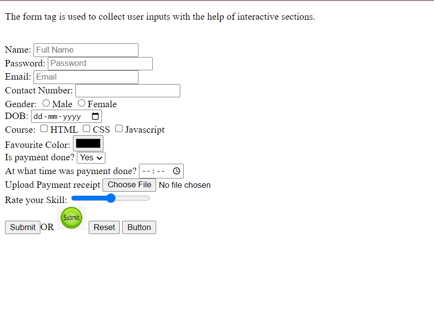
Have a look at the source code of the above attached snapshot.
Thanks for reading. Happy Learning 🙂


