

Flexbox and it's properties
In this article we will try to understand flexbox and learn about it's properties.


What is flexbox?
Flexbox (Flexible Box Module) is a one-dimensional layout method for arranging items in rows or columns.
The main purpose of flexbox is to give the container ability to alter its items’ width, height, order to fill the available space, mostly for displaying the responsive behavior of the web page. A flex container expands items to fill available free space or shrinks them to prevent overflow.
There are no shortage of properties in Flexbox, some of them are applied on parent (flex container) and some of them are applied on child (flex items). Gone are the days when we used float and positioning for displaying responsiveness, flexbox makes our life much more easier.
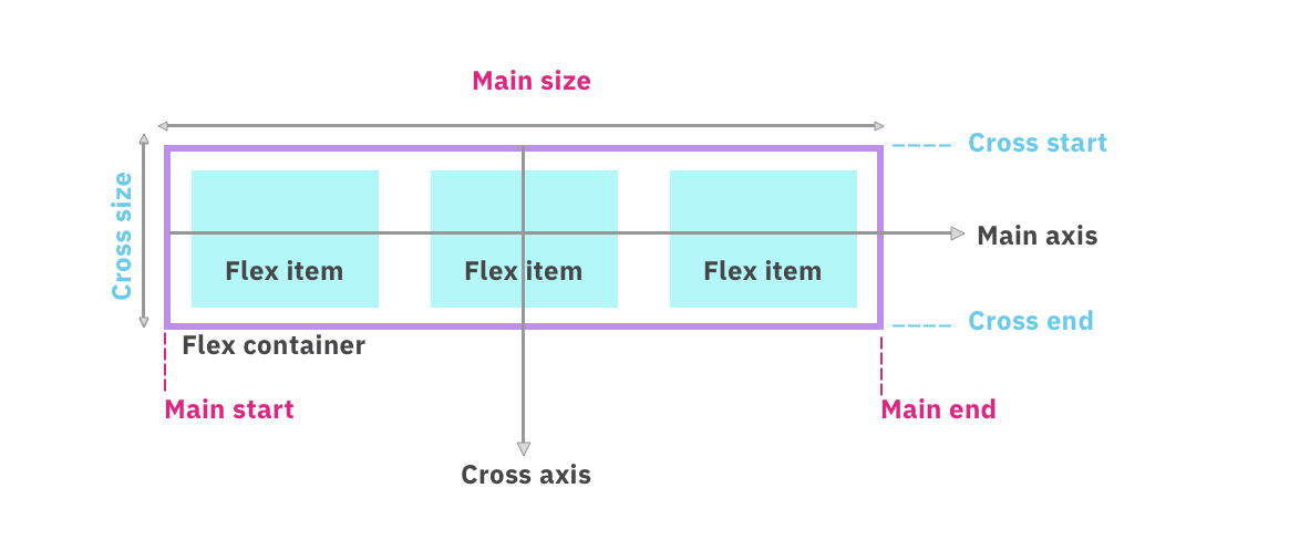
There are two axis named as main axis and cross axis on which items are laid out. Have a look at the below image.
Now, let's turn our attention to flexbox Properties.
Flexbox Parent Properties:
display
Thedisplayproperty defines a flex container; inline or block depending on the given value. It enables a flex context for all its direct children.
/* Syntax */
  display: flex;
flex-direction
Theflex-directionproperty defines in which direction the flex-items in the container will be stacked. The four possible values of flex-direction is: top to bottom, bottom to top, right to left, and left to right.
/* Syntax */
/* The flex items are stacked in a row */
flex-direction: row;

/* Like <row>, but reversed */
flex-direction: row-reverse;

/* The flex items are stacked in a column */
flex-direction: column;

/* Like <column>, but reversed */
flex-direction: column-reverse;
flex-wrap
This property offlex-wrapis used wrap the flex items into multiple lines or force them into one line according to the need. By default, all the flex items will try to fit in one line. But we can change that and allow the items to wrap as per our need.
/* Syntax */
flex-wrap: nowrap; /* Default value */
flex-wrap: wrap; /* flex items will be wrapped in multiple lines */
flex-wrap: wrap-reverse; /* flex items will be wrapped in multiple lines but in reverse*/
flex-flow
This is a shorthand for theflex-directionandflex-wrapproperties. It specifies both the direction of a flex container, as well as its wrapping behavior. The default value is row nowrap.
/* Syntax */

/* flex-flow: <'flex-direction'> */
flex-flow: row; /* The flex items are stacked in a row */
flex-flow: row-reverse; /* Like <row>, but reversed */
flex-flow: column; /* The flex items are stacked in a column */
flex-flow: column-reverse; /* Like <column>, but reversed */

/* flex-flow: <'flex-wrap'> */
flex-flow: nowrap;
flex-flow: wrap; /* flex items will be wrapped in multiple lines */
flex-flow: wrap-reverse; /* flex items will be wrapped in multiple lines but in reverse*/

/* flex-flow: <'flex-direction'> and <'flex-wrap'> */
flex-flow: row nowrap; /* The flex items are stacked in a row with no wrap*/
flex-flow: column wrap; /* The flex items are stacked in a column with wrap */
flex-flow: column-reverse wrap-reverse; /* The flex items are stacked in a reverse column with reverse wrapping */
justify-content
The propertyjustify-contentdefines how the space is distributed around content items along the main axis. It helps distribute extra free space leftover when either all the flex items on a line are inflexible, or are flexible but have reached their maximum size. It also exerts some control over the alignment of flex items when they overflow the line.
/* Syntax */
/* Positional alignment */
justify-content: center;     /* Pack items around the center */
justify-content: start;      /* Pack items from the start */
justify-content: end;        /* Pack items from the end */
justify-content: flex-start; /* Pack flex items from the start */
justify-content: flex-end;   /* Pack flex items from the end */
justify-content: left;       /* Pack items from the left */
justify-content: right;      /* Pack items from the right */

/* Baseline alignment */
/* justify-content does not take baseline values */

/* Normal alignment */
justify-content: normal;

/* Distributed alignment */
justify-content: space-between; /* Distribute items evenly
                                   The first item is flush with the start,
                                   the last is flush with the end */
justify-content: space-around;  /* Distribute items evenly
                                   Items have a half-size space
                                   on either end */
justify-content: space-evenly;  /* Distribute items evenly
                                   Items have equal space around them */
justify-content: stretch;       /* Distribute items evenly
                                   Stretch 'auto'-sized items to fit
                                   the container */

/* Overflow alignment */
justify-content: safe center;
justify-content: unsafe center;
align-items
Thealign-itemsproperty is used to align the flex items on the Cross Axis. This is same as justify-content but instead of main axis it works on cross-axis.
/* Syntax */
/* Basic keywords */
align-items: normal;
align-items: stretch;

/* Positional alignment */
/* align-items does not take left and right values */
align-items: center; /* Pack items around the center */
align-items: start; /* Pack items from the start */
align-items: end; /* Pack items from the end */
align-items: flex-start; /* Pack flex items from the start */
align-items: flex-end; /* Pack flex items from the end */

/* Baseline alignment */
align-items: baseline;
align-items: first baseline;
align-items: last baseline; /* Overflow alignment (for positional alignment only) */
align-items: safe center;
align-items: unsafe center;
align-content
Thealign-contentproperty is used to align the flex container's lines within when there is extra space in the cross-axis. This property does not work when we have flex-wrap: nowrap.
/* Syntax */
/* Basic positional alignment */
/* align-content does not take left and right values */
align-content: center;     /* Pack items around the center */
align-content: start;      /* Pack items from the start */
align-content: end;        /* Pack items from the end */
align-content: flex-start; /* Pack flex items from the start */
align-content: flex-end;   /* Pack flex items from the end */

/* Normal alignment */
align-content: normal;

/* Baseline alignment */
align-content: baseline;
align-content: first baseline;
align-content: last baseline;

/* Distributed alignment */
align-content: space-between; /* Distribute items evenly
                                 The first item is flush with the start,
                                 the last is flush with the end */
align-content: space-around;  /* Distribute items evenly
                                 Items have a half-size space
                                 on either end */
align-content: space-evenly;  /* Distribute items evenly
                                 Items have equal space around them */
align-content: stretch;       /* Distribute items evenly
                                 Stretch 'auto'-sized items to fit
                                 the container */

/* Overflow alignment */
align-content: safe center;
align-content: unsafe center;
gap, row-gap, column-gap
The gap property is used to control the space between flex items.
/* Syntax */
gap: 10px; /* row-gap */
gap: 10px 20px; /* row-gap column gap */
row-gap: 10px; /* row-gap */
column-gap: 20px; /* column gap */
Flexbox Child Properties:
order
Theorderproperty specifies the order in which flex items will appear in the flex container.
/* Syntax */
/* <integer> values */
order: 5;
order: -5;
flex-grow
Theflex-growproperty defines the ability for a flex item to grow with respect to other flex items.
/* Syntax */
/* <number> values */
flex-grow: 3;
flex-grow: 0.6;
flex-shrink
Theflex-shrinkproperty defines the ability of a flex item to shrink in accordance with other flex items.
/* Syntax */
/* <number> values */
flex-grow: 2;
flex-grow: 0.4;
flex-basis
Theflex-basisproperty specifies the initial length of a flex item.
/* Syntax */
/* Specify <'width'> */
flex-basis: 3px;

/* Intrinsic sizing keywords */
flex-basis: max-content;
flex-basis: min-content;
flex-basis: fit-content;

/* Automatically size based on the flex item's content */
flex-basis: content;
flex
Theflexproperty is the shorthand forflex-grow,flex-shrinkandflex-basisproperties. The second and third parameters i.e. (flex-shrink and flex-basis) are optional.
/* Syntax */
/* Keyword values */
flex: auto;
flex: initial;
flex: none;

/* One value, unitless number: flex-grow
flex-basis is then equal to 0. */
flex: 2;

/* One value, width/height: flex-basis */
flex: 10px;
flex: min-content;

/* Two values: flex-grow | flex-basis */
flex: 1 30px;

/* Two values: flex-grow | flex-shrink */
flex: 2 2;

/* Three values: flex-grow | flex-shrink | flex-basis */
flex: 2 2 10px;
align-self
Thealign-selfproperty is used for aligning the selected item inside the flex container. This property overrides the default alignment set by the container'salign-itemsproperty.
/* Syntax */
/* Keyword values */
align-self: auto;
align-self: normal;

/* Positional alignment */
/* align-self does not take left and right values */
align-self: center; /* Put the item around the center */
align-self: start; /* Put the item at the start */
align-self: end; /* Put the item at the end */
align-self: self-start; /* Align the item flush at the start */
align-self: self-end; /* Align the item flush at the end */
align-self: flex-start; /* Put the flex item at the start */
align-self: flex-end; /* Put the flex item at the end */

/* Baseline alignment */
align-self: baseline;
align-self: first baseline;
align-self: last baseline;
align-self: stretch; /* Stretch 'auto'-sized items to fit the container */

/* Overflow alignment */
align-self: safe center;
align-self: unsafe center;
Thanks for reading and Happy Learning! 🙂