


Now a days each and every person mostly use either their tablets or mobile devices for viewing a website and these websites are perfectly available in different devices, be it mobile, tab or laptops. All of this is possible just because of a concept called Media Queries.
What is Media Query?
Media query in CSS is a way by which we can create responsive web pages. With the help of media query we can target many things such as width and height of the viewport, width and height of the device, orientation, resolution. We can provide different CSS styles at different breakpoints which will apply these styles and the web pages will be displayed accordingly in different devices.
/* Syntax */
@media mediatype and (expressions) {
  CSS-Code;
}
A media query consist of a media type that can contain one or more expression. Now, let us look into media type.
Media Types
Media type basically tells us what type of device we are targeting. Different types of media types are listed below:
all: This is used for all the devices as it is suitable for all.print: This is used for paged material and documents which we view in print view mode.screen: This is used primarily for screens.
Features of Media query
There are many features of media query which are listed below:
color: The number of bits per color component for the output device.grid: Checks whether the device is grid or bitmap.height: The viewport height.aspect ratio: The ratio between width and height of the viewport.color-index: The number of colors the device can display.max-resolution: The maximum resolution of the device using dpi and dpcm.monochrome: The number of bits per color on a monochrome device.scan: The scanning of output devices.update: How quickly can the output device modify.width: The viewport width.
Logical operators
We can use the logical operators not, and, and only for composing complex media queries. We can also combine multiple media queries into a single rule by separating them with commas.
and: It is used for combining multiple media features together.not: It is used to negate a media query, returning true if the query would otherwise return false.only: It is used to apply a style only if an entire query matches.,(comma): It is used to combine multiple media queries into a single rule.
Example
Have a look at this example:
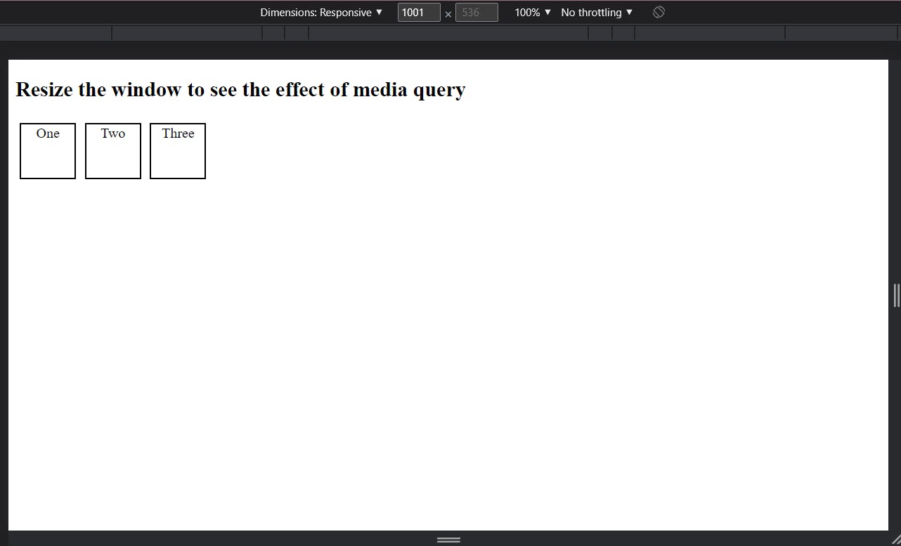
Width more than 1000px
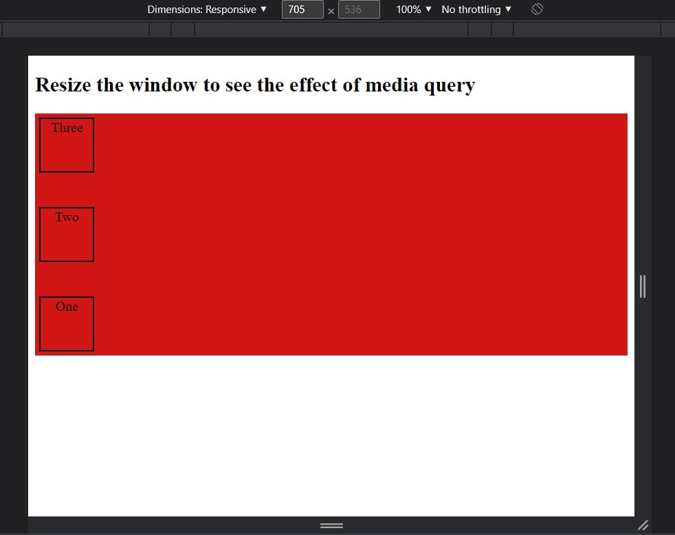
Width between 701px and 1000px
Width less than 700px
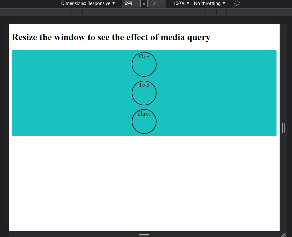
Please take a look at the source code of the above attached screen shots.
Thanks for reading. Happy Learning 🙂